A giant on digital paws

Taming uncontrolled growth
Masses of content, grown organically without a system or structure; the WWF Switzerland website had become overgrown over the years. Our mission was to tame its content and to technically redesign the site. Stefan Schefer, our web solution specialist remembers: “This website was a little like a wild animal. We had to first find out where and how we had to tackle it. During the conception phase, we often encountered the question of which came first – the chicken or the egg? The visual concept or the content?”
Simplifying the clutter
“Our website was very spare. A lot of information, little emotion, almost like a Wikipedia page. Without emotions it is difficult to inspire and retain our supporters. But this was our goal,” says Gregor Nilsson, former Chief Digital Officer at WWF Switzerland, current getunik CEO.
“During the conception phase, we often encountered the question of which came first – the chicken or the egg? The visual concept or the content?”
Stefan Schefer, getunik ag, Consultant Web Solutions
Staying up-to-date
Arguably the biggest challenge was releasing a technically up-to-date website into the wild on its “go live” date. No simple task with a project duration of two years. This had to be constantly taken into consideration when selecting the Drupal 8 technology used, as well as the user interface components.
Satisfying stakeholders
WWF Switzerland has many stakeholders with different needs in relation to the website. We had to find a way to address all of these without losing focus on the essentials.
Attracting donors
Like all NPOs, WWF is dependent on donations. The following question always featured in all of our deliberations: How can we gain the visitors’ trust (and donations) using the new website?


Focus & orientation
Our content strategy was set early on: Massive reductions, focus and setting priorities. In doing so, we asked ourselves the question: What is really important for the users? How do we make sure that we don’t lose traffic on the important sites despite the reduction? We focused on the WWF core issues “Global Goals”, “Endangered Animals” and “Biodiverse Regions” and facilitated access to issues such as “Sustainable Living”. Additionally, an important and well-loved application, the footprint calculator, was completely revised and tailored towards use on mobile devices.
Images & stories
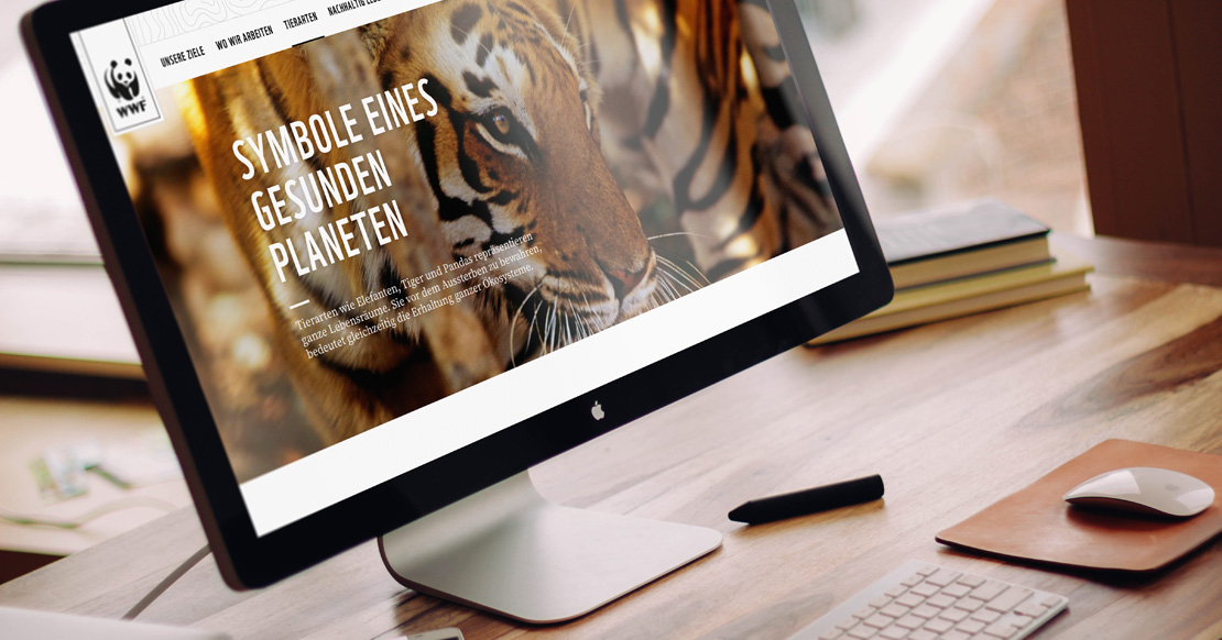
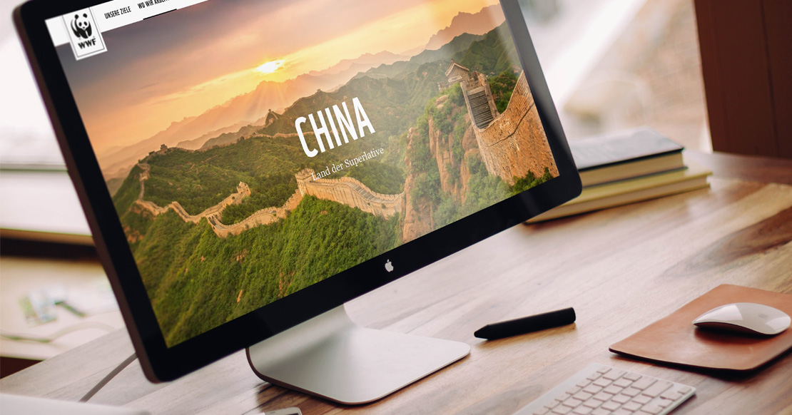
With attractive, sometimes moving images and exciting storytelling, the visitors are motivated to dive into a topic. Of course, the website still has a large amount of background knowledge available, but it can now be found where it belongs – in the background, neatly edited and structured.
Sensitivity
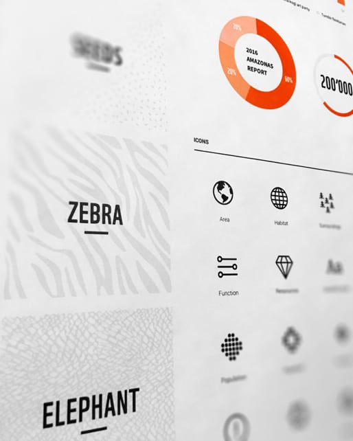
The donor appeals have been deliberately kept discreet, and are first brought to the visitor’s attention when they have shown a strong interest in a project. Visually high-quality and systematically used call-to-action elements and a simple donation process make donating very easy for them.
Effect
WWF Switzerland and getunik AG are now able to look back on a partnership of nearly 20 years. This project is by far the largest and most impressive in getunik’s portfolio.


